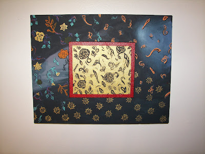

The second one is an abstract of the First Vision. She wanted something religious in the way of a painting, so this is what I came up with.
The third painting is just another abstract using a combination of elements that were in some of the other pieces we were doing. I wasn't sure she would like this, as I did it while she was working. Turns out she thought it was great. Who knew?
This fourth one turned out to be her favourite however, again, I wasn't sure she would like it at all. Later on I will explain how we changed/recycled/converted an old bookcase with poetry books, but with that in mind I made this collage using pieces from the books she had and also a bit of paint, a photograph from National Geographic, and ink. The quote on the base says: "de gustibus non est disputandum" or " there is no accounting for taste" in Latin, which she thought was hilarious.
The next one is based with text poetry from the books, with small pieces flying up and away into the light stream. This one got approval as well. I guess I should say there was one painting that needed to be reworked to make the cut, I thought so as well, and also one painting (ugh, that I neglected to photograph!) that she chose to hang in her room instead of the living area.
The last one was done by her best friend. It's a copy from one of #5's favourite artists, and although I do not know the artist's name the title of the painting was "Temple". Her best friend took almost two entire days copying this to almost perfection. I am sure the artist would be hugely flattered. It was amazingly close.
Friday, August 15, 2008
the Art
Posted by
S'mee
at
1:54 AM
![]()
Labels: "a corner in my home", art, bonding, BYU, cheap, college, colour, daughters, decorations, diy, environment, family, friends, house, inexpensive, learning, painting, photo op, recycling, saving money, self reliance, text, wall arrangement, words

Subscribe to:
Post Comments (Atom)


7 comments:
Okay, I kind of have to say I like the old place. ;-) Yeah nothing like BYU landlords. bleh.
I really like the second one! At first I was quite sure if they went together, but after reading your explanation, they do! I like the surreal first vision thing. (Yeah, you can tell I'm really into the arts, because I know how to express all those technical art terms and all.)
I really like the one next to the bottom one. It looks like one of those rainy places in Europe that people like to paint. I can see a statue in the back and a little woman walking around a fountain.
The last one is really neat. And I really like the paisley one. I think #5s first attempt is good enough to keep going. She has an artistic flair and just needs to loosen up a bit. Just my opinion and all.
All in all I think you all had a bit of fun expressing yourselves. They're all great and I'd rather have something painted by you than some random person's art in my home.
Can't wait to see the other changes. This is kind of like a good HGTV show!
eek! HGTV? hehe ; ) We did have fun! I was really nervous because she is very specific about what she does and does not like and one brush stroke could kill it! That last one, wow, it was crazy detailed and "D" did an amazing job. I am not a fan of the painting per say, but the fact that she got it almost perfect is commendable, and #1 (and all the roomies)LOVED it.
Thor wondered about the second one also, then like you he read the explanation and saw it.
My two favourites were the 1st Vision and that second to the last one...maybe we're sisters???
There's no accounting for taste in latin. I love that!
thanks Alison! Yeah I was trying to think of what to put on the piece. I knew I wanted a phrase and #5 had mentioned Latin. I bounced a few in my head and then settled n that one, well because the piece is rather "different". ; )
Loved the 3rd picture! I also love the First Vision piece! What fun you all had! That book case is GREAT!
Thanks Leaanne! That third one is actually a piece of tin that I bought at Target, it had a different saying on it and had been marked down to $4.99, so I snatched up a bunch of them not knowing what I'd do with them!
I absolutely love the First Vision interpretation. Can I pin it?
Post a Comment